The Donkey Sanctuary
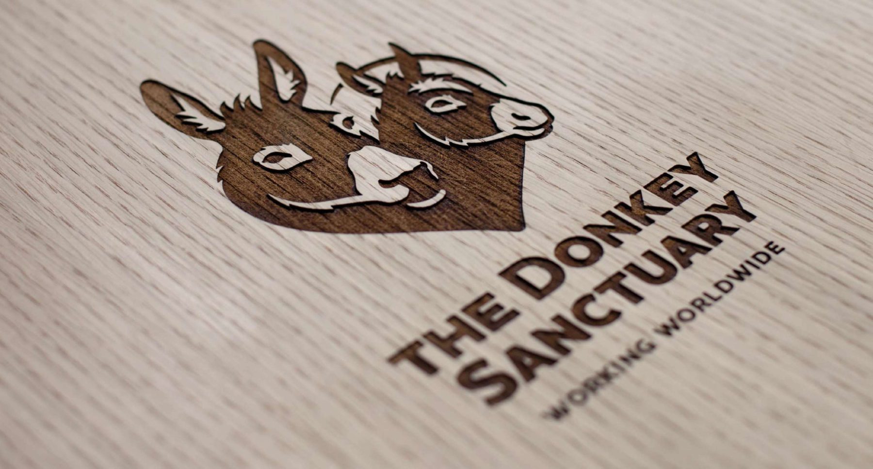
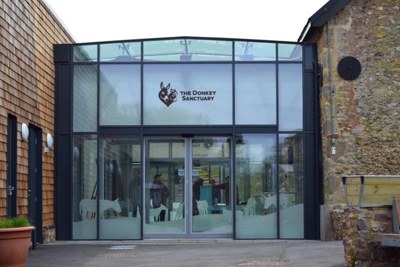
One of the world’s largest equine charities, The Donkey Sanctuary, has been rebranded by award-winning agency The Allotment, with G-Type’s Houschka Alt Pro typeface taking centre stage in the new identity.
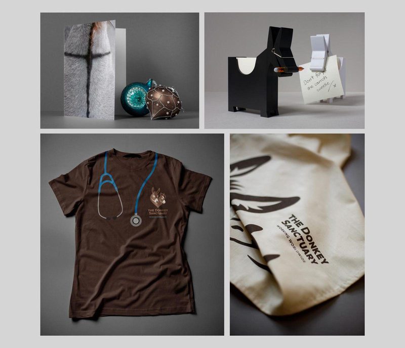
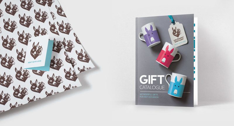
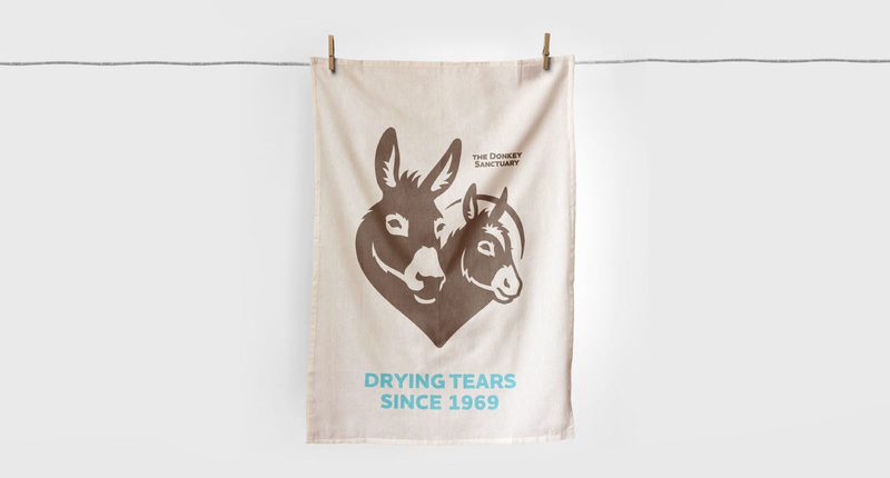
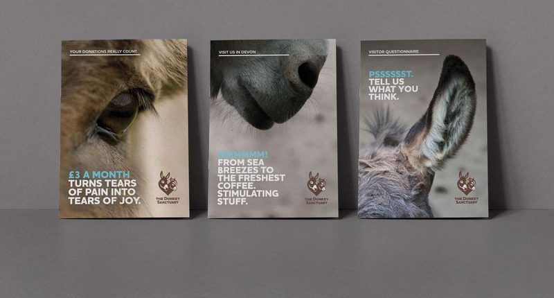
Deployed primarily in caps and small caps, the Houschka Alt Pro font is used in the Devon based organisation’s new logo and across all other key identity components: branded literature, wayfinding systems, vehicle livery and gift shop products. The charity are also using the web versions to great effect on their website.
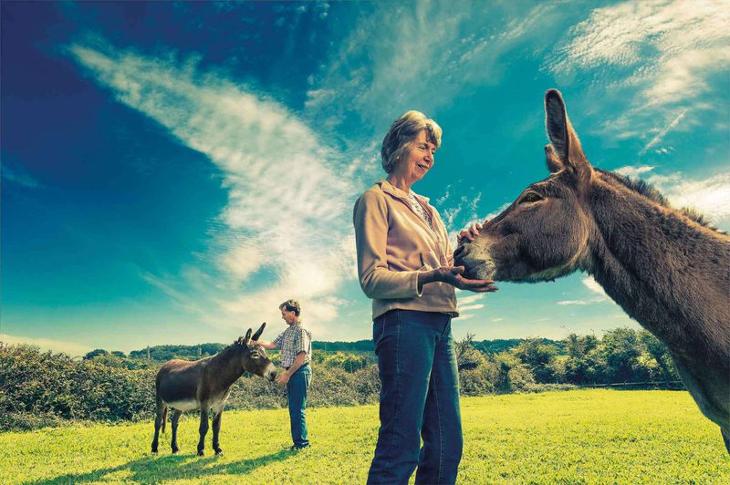
The Donkey Sanctuary is a UK based charity working worldwide to improve conditions for donkeys and mules. Founded in 1969 by Dr Elisabeth Svendsen MBE, the organisation was granted charitable status in 1973 and has cared for thousands of donkeys across the UK and Ireland since then.
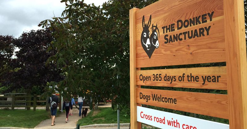

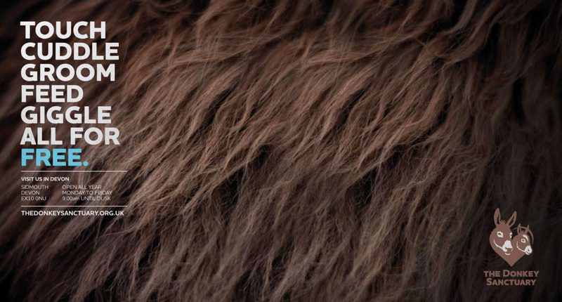
The Donkey Sanctuary is also a popular visitor attraction, pulling in more than 350,000 people a year to the Sidmouth HQ and 5 other regional sanctuaries in Manchester, Belfast, Birmingham, Ivybridge & Leeds. Houschka Alt Pro’s clarity and legibility works well for the charity’s signage & wayfinding systems, a good indicator of the typeface’s versatility.
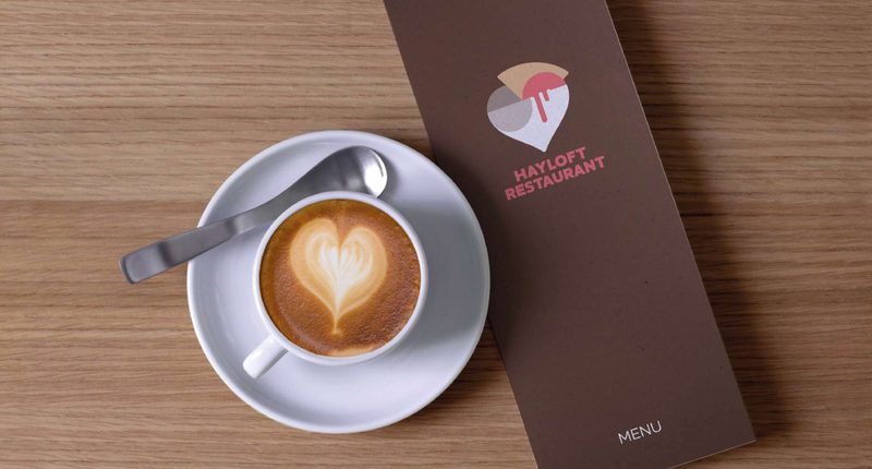
The Allotment created a wonderful suite of icons and signage elements for the visitor centre and coffee shop, all supported by the typeface. New merchandising and branded gifts carry a prominent typographic focus.